
Constraints Made Danish Design Good
2026-08-26 — by Tommy Jepsen
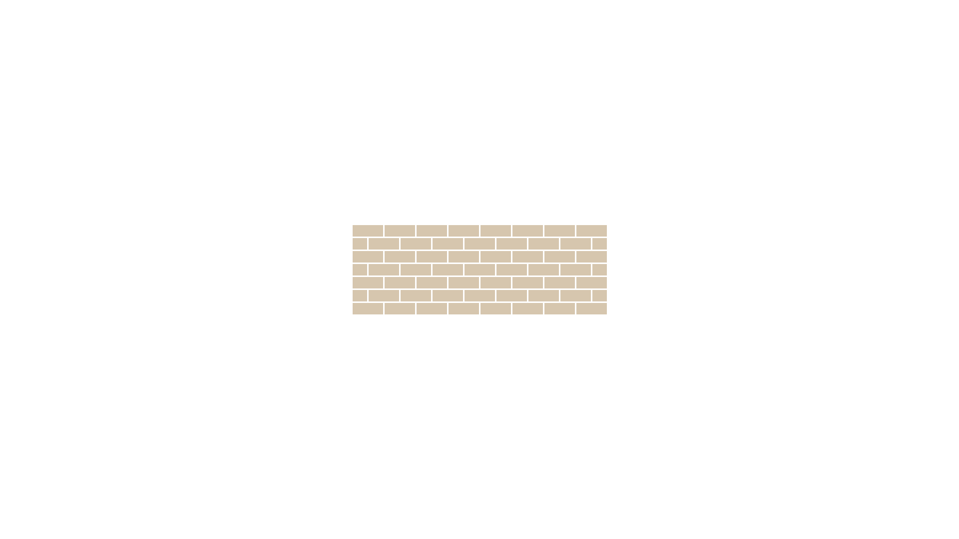
Some of the best Danish architecture was built when there was almost nothing to build with.
After the war, materials were rationed. Steel and concrete were spoken for, and what was left for housing was the ordinary domestic brick, the cheap kind a local brickworks could actually deliver. Kay Fisker built with it anyway. Vestersøhus in Copenhagen and large parts of Aarhus University are the same standard brick doing several jobs at once: structure, weather skin, and the entire facade decision in one material.
I lived next door to Vestersøhus for a few years, in another Fisker building nobody has heard of. Same brick, same logic, no postcard. You notice it more in the everyday version: the window sizes, where the light lands in the stairwell, a cheap facade that still feels considered forty apartments in.
That's the period people still photograph. It isn't a coincidence.
The shortage did the editing
A brick wall doesn't let you do much. You pick the bond, the window rhythm, the depth of the reveal, the line where the wall meets the ground. Most of the choices an architect has today were made for Fisker before he started. What was left was proportion and repetition, and proportion and repetition is what holds up seventy years later.
I don't think he was more talented than the people who came after him. He had fewer options, and options are what make work look undecided.
Mogensen worked from a spec, not a mood board
Børge Mogensen took over furniture design at FDB, the Danish consumer co-op, in 1942. The brief was closer to a product spec than a creative one: furniture an ordinary wage could pay for, sized for a small apartment, made from Danish wood, on a factory line, in quantity.
So he measured. Flat sizes, plate diameters, how tall a glass is, how much a family actually owns. The J39 chair has a woven paper cord seat because leather and steel weren't available. Today that seat reads as a signature. At the time it was the material you could get.
Rationing did the hardest part of design for both of them. It cut the option space before the work started.
Product design has no rationing left
We have the opposite problem. Any font, any layout, any animation, any number of screens. A design system with 400 components and no cost to adding the 401st. And now a model that will hand me ten variants of a screen in a minute, all plausible, none of them arguing back.
Nothing pushes back, so the first draft is usually the one that ships. Not because it was right, because there was no reason to reject it. That's how you end up with three date pickers, a modal inside a modal, and a settings page that's a list of everything anyone ever asked for.
Give the work a material
The fix I keep coming back to is picking the shortage on purpose, before I open Figma.
Some that have actually worked on my own projects:
- No new component. The feature has to be built from what's already in the codebase. If it can't be, that's a real signal about the feature, not about the system.
- One screen. No modal, no second step, no wizard. If the flow doesn't fit on one screen, the flow is the problem.
- Existing tokens only. No new color, no new spacing value, no new font size. Fisker had one brick. I have the palette that's already shipped.
- A word count on the copy. Empty states and error messages get a limit, so the sentence has to say the thing instead of hedging.
None of these make the work harder. They make it faster, because most of the decisions are already gone and I'm left with the two or three that matter.
It only counts if you can't lift it
The catch is that a self-imposed constraint is easy to drop the moment it gets inconvenient. Fisker couldn't order steel. I can add a component whenever I feel like it.
So the constraint needs a mechanism outside my own discipline. A rule that a new component needs three real usages before it lands, checked in review. A performance budget in CI that fails the build instead of printing a warning. A design review where "which existing pattern does this use" is the first question, not the last.
That's the part I find useful about the whole period. Fisker and Mogensen weren't practising restraint as a style. They were working with what they had, and the work came out looking decided because the alternatives weren't on the table.
We have to put our own limits back. It's a worse deal than rationing, but it's the same result.
More to read

Let's connect on LinkedIn ✌️
Dropping random thoughts, AI experiments, product design insights and more.